
Siemen Dijkstra (born 1968).
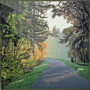
Siemen grew up in Drenthe, in a small village called Pesse. A highway was built alongside it in the 1970s. A tunnel connects both sides. On the other side lies the Dwingeloose Heide, also known as NP Dwingelderveld. After studying at ABK Minerva in Groningen (1991), Siemen moved back to Drenthe and ended up in Dwingeloo, on the other side of the large heathland. There, Siemen carved and printed countless landscapes over the course of 35 years. Up until today, Siemen creates prints of landscapes that matter. The landscape of his youth has changed drastically, sometimes for better, but mostly for worse. “Landscapes that no longer exist” would be a fitting title for almost all of his work. And yet, Siemen continues to cut and print, so that the landscape will not be forgotten once it is gone. The woodcut is a patient work; one must not be in a hurry. An oeuvre is not created in one year…
Diana van Hal, Willem de Koning Academy in Rotterdam, 1988
Lithographic printing – Diana van Hal.
My favourite technique is the linocut. I make monumental linocuts: Big Prints. With black I print on linen or felt. Multi-coloured linocuts of a more modest size are printed on paper, occasionally mounted on wooden panels. The contrast between the energetic colourful prints and modest monumental black and white linocuts is striking.
Wood and linocuts are especially suited for printing patterns and structures. That is my way of working. I weave different textile-like patterns into a harmonic and exuberant combination. Using the power of black makes the structures stand out even better.
Music, ethnic art and my travels to West Africa and South America are an important source of inspiration. People, animals and botanical shapes are mixed in my work into an intimate world. Patterns from all over the world are important elements in the linocuts. Despite the busy patterns and colours, peace and harmony often arise during the production process.
Playing with the materials, shapes and collaborating with others, I discover new ways of working so new stories are created each time.
Soon after I graduated from the Willem de Koning Academie, I had the opportunity to contact Galerie Petit in Amsterdam and had many exhibitions there. I also did some projects there. At Petit I met Harry de Leeuw and we became friends. How wonderful it is to now show my work in Harry’s gallery.
My works are part of the collections of:
ING and SNS Bank, many art libraries, hospitals, art collections of businesses, and many private art collectors.

Ton de Laat (‘s-Hertogenbosch 1946 – Amsterdam 2016) was a self-educated artist. He was the (youngest) son of the Brabant graphic artist Hendrik de Laat (1900-1980), but he never took classes from his father. However, his father taught him “how to hold a pencil and a pen” and “how to look at things as if my eyes were a dissecting knife“.
For more than thirty years Ton de Laat has been affiliated with Galerie Petit in Amsterdam . This gallery focused mainly on lyrical realism in art, but Ton’s work cannot be categorized in any art movement. Reality is always has been his starting point though.
For Ton de Laat, drawing was the basis of his artwork. His artwork has its own language. His drawings, etchings and aquarelles are defined by refinement, intimacy, craftsmanship and humour. Subtleness is a characteristic as well: looking at his work “with eyes like a dissecting knife” pays off.
His humor is exemplified by the bookwork (with reproduced aquarelles) called “Mus Musculus; the reprint of an essay published in 1925 to reveal the historical identity, meaning and scope of the HUISMUIS (sparrow) ” (1991). With this essay, someone called A.H.M. the Laat hoped to obtain “a doctor’s degree from the University of Vistebjorg, Denmark ……” This folder (is for sale in Galerie Achtendertig.
The exhibition includes a number of aquarelles that Ton painted from stamps he invented and made himself (including the perforated edges).
The etchings of the folder “Schelpen (Shells)” (2001) are displayed here as well. Ton made these etchings as a homage to the Haagse Etsclub (Hague Etching Club). Some copies of the folder are still for sale.
A serious book written by Ton de Laat is “Pillows and Worries, An Investigation into Historical Drawing Materials and Techniques” (2000). A number of copies of this pamphlet is also for sale at the exhibition.

Hans Bionda is an fine-art painter from Arnhem. He mainly works in oil paint using various techniques. Hans makes very realistic landscapes, he made works of the Slufter (Texel) and the Hoge Veluwe. Yet the landscapes are not a photo representation, everything that Hans does not find appropriate, he omits. This leaves an unspoilt and idyllic landscape. He says about his work: “The landscape with its limitlessness and silence is my source of inspiration. Representing the beauty of nature is the basis of my work.”

Leon Mommersteeg shows work on a small scale. He isolates his subject from any environment. He leaves the viewer only with what he wants to show: the subject, but especially shape, structure, color and finish. Little stories in beautiful materials. Nature is an inexhaustible source of inspiration and the material used is optimally utilized. He aims for a perfect finish and a piece where ‘looking better pays off’.
Mommersteeg’s work fits into the tradition of Japanese netsuke cutters, the ‘belt buttons’ that belong to the kimono costume.
In addition to netsuke, Leon shows buildings under glass bells. Poetic constructions of paper, wire and LED lighting. He describes them as: ‘sets for films that will never be made’.

Petra tolboom, ething and embroidery.

Petra Tolboom is a visual artist. She makes etchings, which she sometimes edits with embroidery.
After being introduced to less toxic etching materials, photopolymer and more in 2005, Petra discovered how much more freedom she can work as a result. In her work she combines these new(er) techniques with the classic etching techniques. The interplay of line, surface, colour, layer upon layer, experiment and research is characteristic of her work.
The moment when the physical prints are formed begins with experimenting: first drawing and then finally making the various etching plates. The final prints often bear little resemblance to the initial image; They are the result of what she wants to tell.
This series with the theme “Above and below the surface” is the search for images that match thoughts about flow, layering, branching, connection, strength and memory. It is a process of converting thoughts into images by feeling, looking, thinking and trying out.
Her studio in Leiden has plenty of room for all the possibilities of etching. It also gives the opportunity to teach; something she likes and does a lot. She also teaches her students the freedom she applies in her work. Investigating your own visual language and daring to experiment with technique and material; Learning, reading, watching, doing, feeling and discovering.
Petra regularly exhibits and often participates in the art route in Leiden. Much of her work is purchased by individuals and collectors. The Leiden Print Room has also purchased work in recent years. Petra Tolboom (1964) Lives and works in Leiden. For more information see website www.petratolboom.nl
Hans van Liempt, Collages.

Hans van Liempt is a graphic artist. He has a great love for everything that has to do with writing, he is permanently fascinated by it. The exhibition shows a selection of small collages, which together form the pages of a diary with light-hearted variations on a theme: short expressions of wondering. Sometimes an image will do, other times he adds a caption.
He got the idea about invented writing from an aspect of a long Jewish tradition, the so-called pseudo-epigraphics. For the caption in his work, he uses letters or characters that only bear resemblance to the script of an existing language. But they are made up and have no actual meaning. It is literally visual language. All letters are cut, torn or cut out. In recent years he has mainly worked with a mixed collage technique, in which he adds paper on paper. The background is processed paper or fabric.

The place
Forty years ago I came here by bike from Utrecht. Pedal all the way to find a landscape that reminded me of the polders of my childhood. An almost infinite space.
Year after year I come back. I’ve been here early in the morning and late at night. In cold and heat. The place has been changed by human hands and by the passage of time. The old ramparts have been removed. There were trees that I still miss. The water has continued to flow, sometimes slow and shallow, sometimes swirling high, sometimes even covered with ice floes.
Season after season I have found something new here. How many times have I painted here, each time with a slightly different look. Because everything is the same, but then again it is not. Because previous experiences stick to the place, the pleasant ones, but also the failures. Because as a young man I also stood here, impatiently, and now that my body can only just handle the stinging winter cold on a manger. Sometimes I really want to be here again, to be able to touch this world.
The reeds, the trees, the distance: they are familiar. It’s my place.
Frank Dekkers

Dutch dunes and French mountains
Kris Spinhoven exhibits more than thirty paintings in Gallery Achtendertig in Rheden. The Dutch coast, polder landscapes, Amsterdam cityscapes, but above all we see the French Prealps. There Spinhoven has been painting the mountains, the vineyards, the little streams, the space, the sky for over thirty years. The techniques are various: there are oil paintings, watercolors and drawings in sumi ink.
Spinhoven always paints on the spot, en plein air. Sometimes one session is enough. Usually the painting asks for the painter to return several times at the same hour, under the same light. That can be difficult, because nature (the weather!) is capricious. But the effort pays off. The space is sensible, the detail visible.
She lives and works alternately in Amsterdam and in the Isère.
For more information about Spinhoven’s working-method, see www.krisspinhoven.com
Under the heading ‘publications’ you can read the book Paintings (text by Peter Hecht) and the book Mountain landscapes (several authors).
Exhibition The Portrait Biennale of Dutch Portraiture from 14 to 22 May 2022 in Loods 6 Amsterdam

Bram Stoof (Enkhuizen 1959) is a contemporary painter based on observation. He mainly uses watercolor and oil painting techniques. However, he is capable to use the modest pencil either. The choice of subjects reaches from the human figure, through architecture and landscape, to still life.
Human beings have always carried the warm interest of Bram Stoof. He paints portraits on commission, painting live model is a popular activity. The painter is also active as a teacher in this profession.
In recent years, the emphasis has come to be the still life in oil paint, when he works in his atelier. When the weather is good, Bram Stoof prefers to work outdoors with watercolors, trees are a favorite subject.
During the first corona lockdown, a series of interior pieces in watercolor were created. The own living room turned out to be a source of inspiration.
Immediately striking about the paintings is the realistic rendering, in which a technique based on the classical method is characteristic. In the field of oil painting, the painter is self-taught, although he attended art academy.
After his studies in Kampen, Bram Stoof settled in Amsterdam, where he lives and works to this day.
Bram Stoof is a member of the Hollandse Aquarellistenkring and the Nederlands Portretschap.

Rolf Weijburg maps the world.
For over three decades, Rolf Weijburg has been reporting on his travels in complex colour etchings in which he fuses elements of cartography, culture, nature, history and architecture into intriguing compositions. Weijburg mainly works in large series, long-term projects that are all travel-related. For more than 15 years he travelled to all the islands around the African continent for the project “L’Afrique Périphérique – an Atlas of the Islands around Africa”, which eventually grew into a series of more than 90 colour etchings and for which he Received the Dutch Graphic Prize. Today, Weijburg is working on a new major project “An Atlas of the World’s Smallest Countries”, a series of colour etchings about the 25 smallest independent countries in the world. But other countries and many Dutch cities do not escape his etching needle.
Ton de Laat wrote in the magazine “Art and Science” (autumn 2012): “… What else do I find so delightful about Weijburgs art? I flee again in catchwords: drawing skills, suggestion of space, use of colour, humour, border decorations, image sequences, inserts, flora, fauna, lettering. Cloudy skies are the ultimate pleasure. To be able to create such an air! With zinc, molten resin powder, corrosive acid, printing ink and paper.
” In 2017, in collaboration with RTV Utrecht, a 40-minute documentary was made about Weijburgs work and travels, in which the origin of an etching is followed, from the journey and inspiration on an African island, through the work and craftsmanship in Weijburgs Utrecht studio, to the presentation of the etching at the opening of an exhibition. The film can still be seen on YouTube https://www.youtube.com/watch?v=ny724S_p2As&t=1106s

Reinder Homan / etching
One person appreciates the craftsman in him, the other sees him as dreamer, a third as a poet; the truth is that all three come together in him. Homan’s work is in a long tradition of landscape etchers, who have been going back 500 years. He is a master in the expression of light, air, space and nature close to us, in a technique that leaves nothing to chance. He makes the wind rustle, the flowers smell in his prints. The freedom Homan finds in this is only possible if the technique is fully controlled. You experience that same all-encompassing freedom as a viewer in his prints.
A boy and his tree.
Peter van Straten once wrote a book with that title. It was about a lonely boy, who found support with ‘his’ tree. This was my book! I was that boy and that tree symbolized many trees and plants. Nonsense, of course, but sometimes a feeling is stronger than a reality. So, that boy is me! That boy was perhaps lonely sometimes and perhaps sought his balance in nature and became so fascinated that he wanted to share this. That boy became a draftsman and later an etcher. In the meantime, that boy has become a man, he still tells his ‘nature stories’ on the etching plate. Sometimes about trees, but also whispering reeds and threatening storms, old buildings in vast parks or fragile flowers in sunny meadows. Time goes on, just a little while and the boy, who became a man, will be an old man … but even then he will still remain ‘The boy of the tree’!
www.reinderhoman.com

Trees Forest Brook and Flowers.
Since 2006 Karin Elfrink has been fascinated by the landscaping around the house in Beek-Ubbergen where she spent her childhood. The forests on the slopes of the Ravensberg, where she could be alone as a child and looked for protection under the foliage of close together standing trees. Later, as a painter she enjoyed the dynamism of the forest, the multitude of the colors green, the changing of light, but also of the static, the monotony, the peace. In paintings she gave these impressions, she wanted to allow the viewer to share in her experiences.
Being in the forest, she is already showing. She takes large sheets of paper to the forest and in the middle of her familiar trees she draws their presence with Indian ink. In the studio, looking at the drawings, which are also autonomous works, she makes the paintings. Look and memory come together.
Besides painting forests, Karin also likes to paint flowers. She does not paint them in a vase, but like you see them outside. With a visual freedom, which she also allows herself with the forest.
Ton de Laat (‘s-Hertogenbosch 1946 – Amsterdam 2016) was a self-educated artist. He was the (youngest) son of the Brabant graphic artist Hendrik de Laat (1900-1980), but he never took classes from his father. However, his father taught him “how to hold a pencil and a pen” and “how to look at things as if my eyes were a dissecting knife“.
For more than thirty years Ton de Laat has been affiliated with Galerie Petit in Amsterdam . This gallery focused mainly on lyrical realism in art, but Ton’s work cannot be categorized in any art movement. Reality is always has been his starting point though.
For Ton de Laat, drawing was the basis of his artwork. His artwork has its own language. His drawings, etchings and aquarelles are defined by refinement, intimacy, craftsmanship and humour. Subtleness is a characteristic as well: looking at his work “with eyes like a dissecting knife” pays off.
His humor is exemplified by the bookwork (with reproduced aquarelles) called “Mus Musculus; the reprint of an essay published in 1925 to reveal the historical identity, meaning and scope of the HUISMUIS (sparrow) ” (1991). With this essay, someone called A.H.M. the Laat hoped to obtain “a doctor’s degree from the University of Vistebjorg, Denmark ……” This folder is for sale in Galerie Achtendertig.
The exhibition includes a number of aquarelles that Ton painted from stamps he invented and made himself (including the perforated edges).
The etchings of the folder “Schelpen (Shells)” (2001) are displayed here as well. Ton made these etchings as a homage to the Haagse Etsclub (Hague Etching Club). Some copies of the folder are still for sale.
A serious book written by Ton de Laat is “Pillows and Worries, An Investigation into Historical Drawing Materials and Techniques” (2000). A number of copies of this pamphlet is also for sale at the exhibition.

Chuck Baker was born in Somerville, Massachusetts, USA in 1953 and currently lives in Nijmegen, Netherlands.
http://www.chuckbakerfotografie.nl
The images in this exhibition are from two series. One is Hiding in Light, which include images from places that mean something special to me. The others are from a series in progress called The Reconstruction of a Moment. The idea for this came when I turned 60. It’s an attempt to manipulate the perception of time.
Technically, it’s a simple process though emotionally, it can be a bit more difficult.
Toy or manipulated cheap cameras are usually used, it depends on the vignette effect of the lens. Most are taken using film however I don’t discriminate between analog and digital. I consider cameras and film tools.
Multiple images are taken as if to reassemble into a panorama. These separate images are sometimes taken at the same time and sometimes a different day. The reconstruction of this moment is really an illusion. One might say that it’s an unreal moment that I have created.
The film is processed in my darkroom. I scan it for a proof sheet and to reconstruct the moment using Photoshop. Some finals are separately printed in the darkroom and manually constructed, using the digital file as a guide, while most are printed using the digital file. I try to do as little Photoshop manipulation as possible to keep any artifact degradation to a minimum. These are then pigment ink printed on a dedicated archival printer. This series of images is starting to evolve into 3 dimensional finals. I’m additionally experimenting with making large digital negatives and printing them using darkroom processes.